If you’re like me, you love looking at photographs. Creating images that capture a viewer’s interest and holds it usually doesn’t happen by accident. When you look at a photograph that captivates you, what is it that keeps you looking at the image? There are several answers to this question and in this blog, I’ll share with you some tips to help you create better composition in your images.
It’s important to look at a scene through your camera and intentionally use elements in the image to improve composition. I’ll talk about the use of compositional aids such as rule of thirds, negative space, leading lines, balance and the use of color. Sometimes making a great photograph means choosing a slightly different camera position or lens choice. More than simply pointing and shooting, a solid thought process should go into composing an image. Be an observer!
Take a look at the image below… what do you see?

No, it’s not a trick question. You should see a black dot, right? Take a look at the next image…now what do you see?

This is not intended to be an eye exam, but with this image, you should see two circles slightly darker than their surroundings. Does one stand out more than another? Most people would say the circle on the right stands out more. Why? It looks a bit darker with more defined edges, doesn’t it? But in reality, the two circles are exactly the same tone. However, the one on the left has a softer edge, making it less defined in the image.
When looking at an image, in most cases, your eye travels to two areas: the area of greatest contrast and the area of sharpest focus. The first image was easy…you have nothing else to look at but the black dot. The second image is slightly different and proves the point I just made about sharpest focus. Even though the two circles are identical in tone, your eye was drawn to the circle on the right because its edge is sharper than the other. It also proves the point about being drawn to the area of greatest contrast. Although your eyes may have seen the fuzzy circle on the left, you probably saw the one on the right first because of the sharp edge contrast against the background.
Composition includes many different variables, including the concept mentioned above, but how does one visualize a composition before getting behind the camera? As I mentioned…be observant!
Ok, let’s dive right into this, shall we?
DISCLAIMER: While some find rules to be confining, I think they are meant to be broken. I’m a strong believer in learning the rules first and then successfully breaking them all you want.
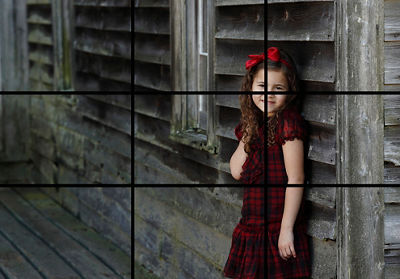
The “Rule of Thirds” is usually one of the first topics taught in a composition class and for good reason. The rule states this: divide your frame up into equal thirds of both the horizontal and vertical axis’s, like the example below, similar to a tic-tac-toe board. The areas where the vertical lines meet the horizontal (circled) are very strong compositional areas to place your subject. This exists to help you understand that centering your subject isn’t usually the best way to showcase the main point of interest. All Canon EOS cameras with the Live View feature can show this grid when Live View is turned on to help you compose your images. The grid is a feature that may be turned on or off in the menu and looks like the examples below.


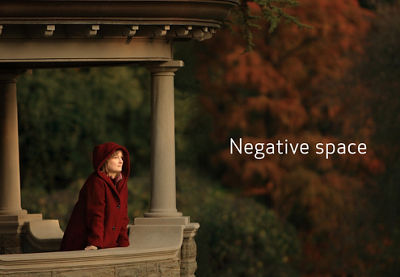
The next area we’ll visit is the use of negative space. It’s defined as the space that surrounds your main subject and it helps create a sense of balance or tension. Here’s a look at some examples:


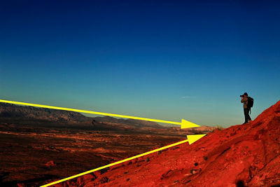
Now let’s take a look at how leading lines help draw the viewer’s eye where you want it to go. While visualizing a photograph, try to look at elements in the image to allow movement to your subject. Diagonal lines are very powerful in an image so try to incorporate them in your composition like these examples:


Sometimes there’s little skill involved and plain old luck comes into play. In this shot, the plumes of mist separated to reveal the subject on the ridge.

Many situations call for the use of color to draw your attention to the subject, like in this next image. Your eye will most likely land on the red color of the boy’s sweatshirt.

One technique I like to use whenever possible is to keep the viewer’s eye moving around the image, only to bring them back to where they started. In this image of the hot air balloons, the strong use of color provides a lot of visual stimulation but it’s difficult to land on one main subject. When I look at this image, my eye travels around and around, noted by the white arrows, but never really exits the frame.

If I have something in the image that frames my subject and helps lock the viewer’s attention, I’ll use it like these next examples:


Here’s one last image to look at, which breaks some rules but is done so successfully. This image of the USS Wisconsin has a very symmetrical look to it but accomplishes the goal of visual stimulation.

So get out there, be a student of observation, learn some compositional rules, make plenty of mistakes but learn from them. And then break the rules! As image-makers, you sometimes have to wear a thick skin and accept the fact that not everyone will like every image you make. It’s okay that they don’t; it’s what makes all of us individuals with our own unique tastes. Most importantly, have fun on your journey and keep on photographing!


